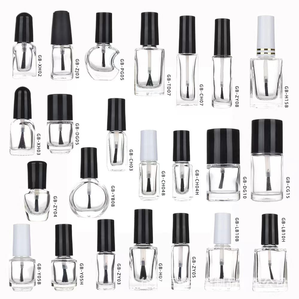
Nail polish isn’t just about color—it’s an experience that begins the moment you lay eyes on the bottle. Packaging plays a pivotal role in attracting consumers, conveying brand identity, and enhancing usability. Below, we break down why these 10 iconic nail polish brands dominate the market, viewed through the lens of their packaging design:
1. OPI
Why it stands out: OPI’s signature square-shaped, wide-neck bottles are instantly recognizable. The ergonomic design ensures a comfortable grip, while the bold, color-coded labels make shade selection effortless. The brand’s playful shade names (like “Bubble Bath” or “Lincoln Park After Dark”) add personality, turning each bottle into a conversation starter.

2. Essie
Why it stands out: Essie’s minimalist, slim glass bottles exude elegance. The tapered shape and clean typography appeal to those who prefer understated luxury. The compact size fits neatly into makeup bags, while the precision brush caters to DIY enthusiasts seeking salon-quality results.
3. Chanel Le Vernis
Why it stands out: Chanel’s iconic rectangular bottles, paired with a black cap and gold accents, scream timeless sophistication. The weighty glass feels luxurious, and the square shape aligns with the brand’s haute-couture aesthetic. It’s not just polish—it’s a status symbol.
4. Dior Vernis
Why it stands out: Dior’s sleek, cylindrical bottles feature a mirrored finish and gradient color bands that reflect the shade inside. The magnetic cap clicks satisfyingly into place, emphasizing premium craftsmanship. The packaging doubles as a chic vanity decor piece.

5. Butter London
Why it stands out: Butter London’s matte, pastel-colored bottles with metallic accents strike a balance between quirky and refined. The wide, flat cap offers better control during application, while the eco-friendly “7-Free” formula is highlighted in minimalist typography—appealing to conscious consumers.
6. Deborah Lippmann
Why it stands out: Deborah Lippmann’s Art Deco-inspired bottles feature a faceted design that catches light beautifully. The luxe gold caps and crystal-like glass evoke old Hollywood glamour, resonating with buyers seeking a touch of vintage elegance.
7. Zoya
Why it stands out: Zoya’s eco-conscious approach shines through its recyclable glass bottles and minimalist labels. The brand uses color-coded caps for quick identification, while the “Big Flat Brush” design caters to efficient, streak-free application—perfect for eco-minded polish lovers.
8. Smith & Cult
Why it stands out: Smith & Cult’s edgy, industrial-chic packaging features a weighted metal cap and a faceted glass bottle. The brand’s name is embossed in bold lettering, creating a rock-and-roll vibe. The unique shape ensures it stands out on shelves and Instagram feeds alike.

9. Holo Taco
Why it stands out: Founded by YouTuber Cristine Rotaru (SimplyNailogical), Holo Taco’s holographic packaging screams “unicorn vibes.” The iridescent caps and rainbow-gradient labels cater to Gen Z’s love for maximalist, Instagrammable aesthetics. Plus, the wide brushes are designed for full coverage in one swipe.
10. ILNP (I Love Nail Polish)
Why it stands out: ILNP’s ultra-thin, holographic labels and gradient-colored bottles mirror its specialty in multi-chrome and holographic polishes. The sleek, futuristic design appeals to tech-savvy buyers, while the secure, leak-proof caps ensure longevity.
Final Thoughts:
Successful nail polish packaging marries form and function. From Chanel’s timeless luxury to Holo Taco’s playful glitter, these brands leverage design to evoke emotions, simplify application, and align with consumer values (like sustainability or self-expression). Next time you pick a polish, remember—the bottle is just as important as the color inside! 💅✨
What’s your favorite nail polish packaging? Let us know in the comments!