Introduction to the Five Elements and Their Importance in Design
In the world of cosmetics, packaging plays a vital role in shaping a brand’s identity and connecting with consumers. More than just an outer shell, the design of a cosmetic bottle or lid serves as a reflection of the product inside and the brand’s ethos. To create harmony between aesthetics and functionality, ancient principles such as the Five Elements Theory can be applied to color matching.
The Five Elements, also known as Wu Xing in Chinese philosophy, consist of Wood, Fire, Earth, Metal, and Water. These elements are believed to represent different forms of energy in the universe and can be used to achieve balance and harmony in various aspects of life, including product design. When applied to cosmetics packaging, the Five Elements can guide brands and manufacturers in selecting color combinations for glass bottles and lids that not only appeal to consumers but also create visual coherence and evoke the desired emotional responses.
By using this ancient system of classification, cosmetic brands can align their product offerings with the energy and symbolism of specific elements, ensuring that the packaging complements both the product and the brand’s messaging. This is especially important when it comes to color choices, as each element is associated with specific colors that convey certain moods and energies.
Five Elements and the Cosmetics Industry
The cosmetics industry, which encompasses skincare, makeup, fragrances, and more, can be analyzed through the lens of the Five Elements. Each element represents distinct qualities and characteristics, which can be matched to different types of cosmetic products.
- Wood: The Wood element is associated with growth, renewal, and creativity. In the cosmetics industry, products that focus on innovation, new formulations, or eco-friendly packaging are aligned with the energy of Wood. Glass bottles that emphasize natural ingredients or sustainability may benefit from being designed with colors associated with Wood, such as greens and blues, to emphasize a connection to nature.
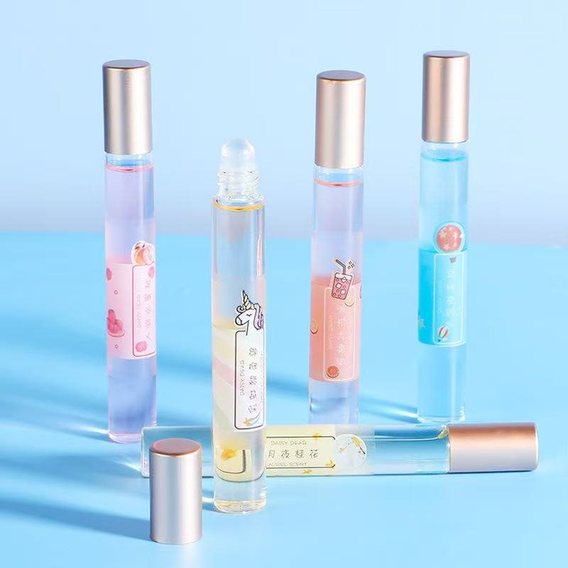
- Fire: Fire represents passion, excitement, and transformation. This element is often linked to bold, attention-grabbing products, such as vibrant lipsticks or dramatic eye shadows. For brands that focus on creating a sense of excitement or allure, using Fire-inspired colors like reds and oranges in their packaging can enhance the product’s appeal. For example, matching a red lipstick with a red or orange cap can amplify the fiery energy of the product.
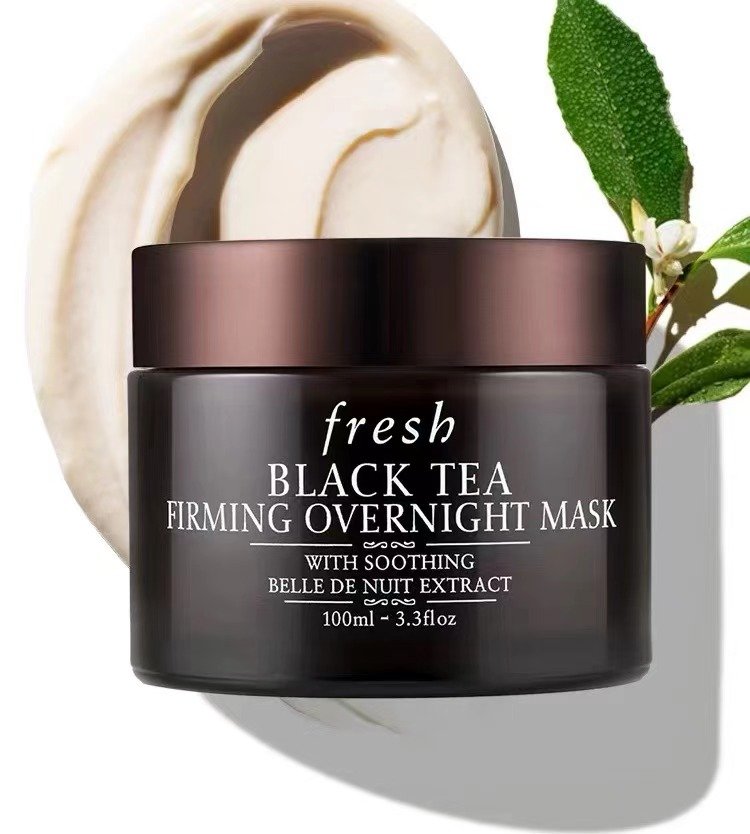
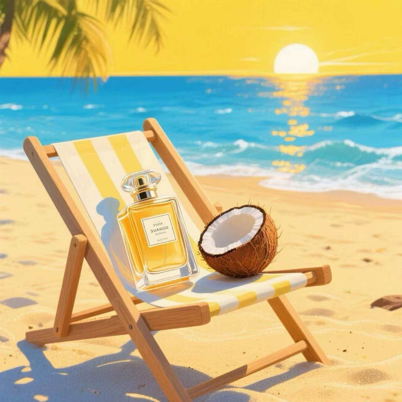
- Earth: Earth is linked to stability, nurturing, and grounding. Products that focus on skincare, moisturizing, or healing are often associated with the Earth element. Packaging for such products might use earthy tones like browns, yellows, or muted greens to convey a sense of calm and reassurance. Skincare products with nourishing ingredients can benefit from Earth-tone bottles to signal their nurturing qualities to consumers.
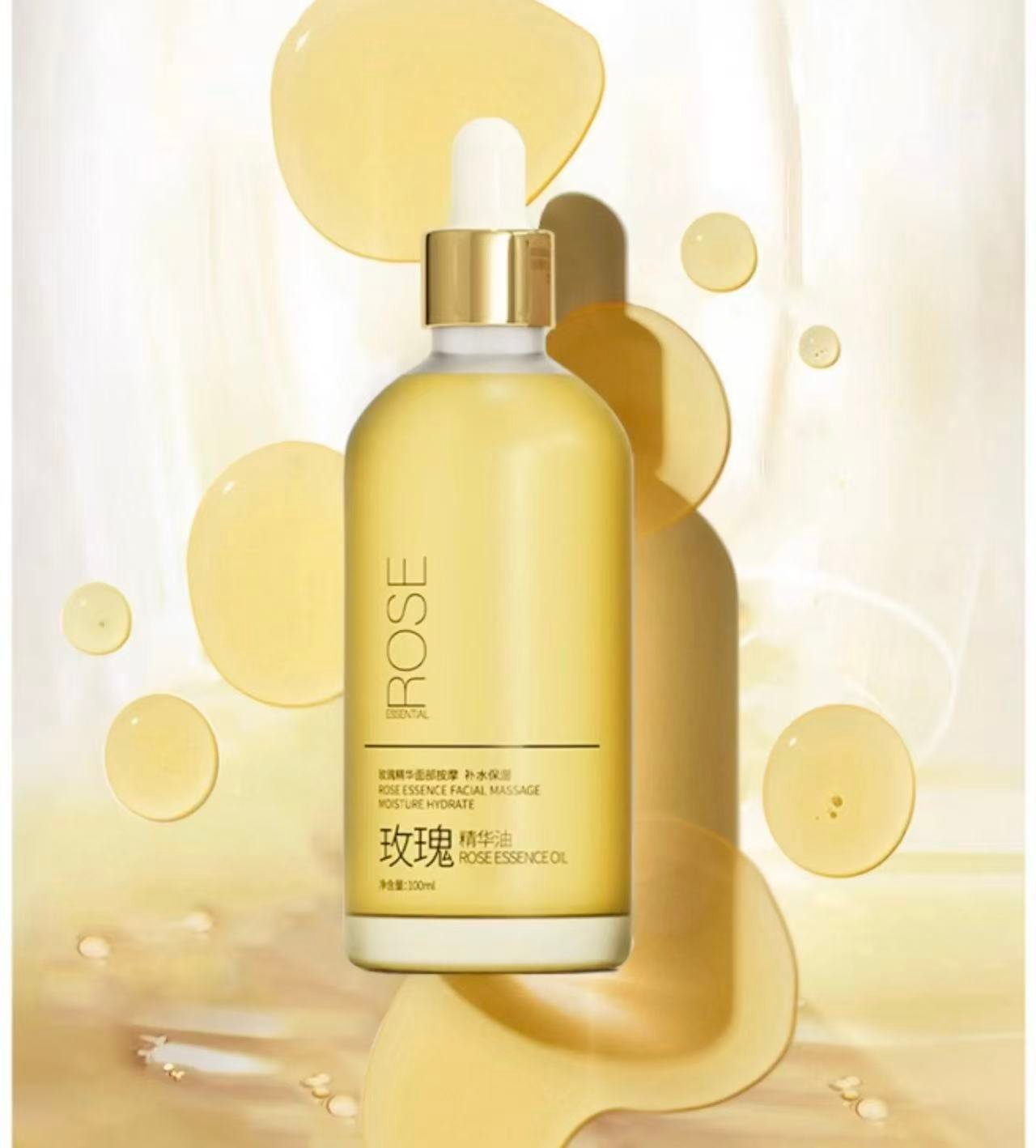
- Metal: Metal signifies precision, luxury, and elegance. In the cosmetics industry, Metal is often associated with high-end, luxury products such as serums, perfumes, and exclusive makeup lines. Glass bottles that utilize metallic finishes, such as gold or silver, reflect the elegance and high value of the product. The pairing of metallic caps with clear or white glass bottles creates a sense of purity and refinement, aligning with the Metal element’s focus on perfection and luxury.
- Water: Water symbolizes fluidity, adaptability, and purification. Fragrances, liquid cosmetics, and products designed for hydration align with the Water element. For packaging, Water-inspired colors like black, dark blue, or shades of aqua are ideal for products focused on hydration or cleansing. These colors evoke a sense of purity and freshness, qualities that are essential in the water-based cosmetic segment.
By analyzing the cosmetics industry through the Five Elements framework, brands can better understand how to align their product types with the appropriate energy. This not only helps with internal branding but also enhances the consumer’s perception of the product, making it feel more aligned and cohesive.
The Mutual Generation and Restraint of the Five Elements
The Five Elements operate within two key cycles: the generation cycle and the restraint cycle. These cycles influence how the elements interact with each other and can provide valuable guidance for selecting complementary colors for cosmetic bottles and lids.
- Generation Cycle: This cycle shows how the elements support and nourish one another. For example:
- Wood generates Fire: Wood fuels Fire, meaning that green and blue tones (Wood) can be successfully paired with red and orange tones (Fire).
- Fire generates Earth: When Fire burns, it produces ash, which nourishes the Earth. Thus, reds and oranges (Fire) pair well with browns and yellows (Earth).
- Earth generates Metal: Metal is found within the Earth, meaning that earthy tones (Earth) work well with metallic colors (Metal).
- Metal generates Water: Metal produces water through condensation, making silver and gold (Metal) complementary to black and blue (Water).
- Water generates Wood: Water helps plants grow, so Water-inspired colors (blues, blacks) complement Wood-inspired colors (greens, blues).
- Restraint Cycle: This cycle shows how the elements control and restrain each other. For example:
- Wood restrains Earth: Wood disrupts Earth, so green and brown tones should be paired cautiously.
- Earth restrains Water: Earth can absorb Water, making brown tones a potential control color for blue or black.
- Water restrains Fire: Water extinguishes Fire, so avoid pairing dark blues or blacks with reds and oranges.
- Fire restrains Metal: Fire melts Metal, so avoid combining fiery tones with metallic colors unless intended for contrast.
- Metal restrains Wood: Metal cuts through Wood, so silvers and greens can be tricky together unless well-balanced.
When applying these principles to packaging design, it’s crucial to understand how the generation and restraint cycles can influence color harmony. For instance, a product that aims to evoke feelings of growth and innovation (Wood) might benefit from a bottle design that incorporates Wood-related colors, but it should avoid colors that restrain Wood, such as metallics (Metal). On the other hand, products that focus on luxury (Metal) might be paired with Earth tones (browns, yellows) to create a balanced and nurturing feel.
Color Representation of the Five Elements
Each of the Five Elements is associated with specific colors that correspond to its unique qualities and energy. In cosmetic packaging, the choice of colors for glass bottles and lids can influence consumer perception and create a deeper connection with the product. Here’s a breakdown of how each element’s colors can be applied in cosmetic packaging design.
- Wood Element Colors: Green and Blue
The Wood element is represented by colors such as green and blue, symbolizing growth, vitality, and renewal. These colors evoke a sense of freshness and connection to nature. In the cosmetics industry, Wood-element colors are especially suitable for products that emphasize natural or organic ingredients, sustainability, or environmental consciousness. For example, a skincare line that promotes eco-friendliness could use green bottles paired with blue lids, signifying both the regenerative nature of the product and its grounding in natural elements.Examples: A glass bottle in shades of green, paired with a blue cap, could work well for an organic serum that focuses on plant-based ingredients. - Fire Element Colors: Red, Orange, and Pink
Fire is the element of passion, energy, and transformation. Colors like red, orange, and pink are associated with excitement and boldness, making them ideal for vibrant, high-impact cosmetics such as bold lipsticks, perfumes, or products marketed towards a more daring audience. Red, in particular, is a strong, attention-grabbing color that conveys confidence, while pink adds a softer, more approachable feel.Examples: A red glass bottle with a pink or orange lid could work for a vibrant line of lipsticks or a bold fragrance that aims to stand out. - Earth Element Colors: Yellow, Brown, and Beige
Earth symbolizes stability, nurturing, and support. Earth-element colors such as yellow, brown, and beige convey warmth, reliability, and comfort. These tones are often used in packaging for skincare products that emphasize soothing, healing, or hydrating qualities. Earth tones create a sense of trust and reliability, making them excellent choices for products like moisturizers, sunscreens, and nourishing creams.Examples: A brown glass bottle with a beige lid could be a perfect fit for a hydrating body lotion or a calming facial cream, emphasizing the product’s grounding and nurturing qualities. - Metal Element Colors: White, Silver, and Gold
The Metal element is connected to precision, luxury, and elegance. Colors like white, silver, and gold evoke feelings of purity, refinement, and high quality. In the cosmetics industry, Metal-element colors are often used for premium, high-end products such as serums, luxury perfumes, or exclusive makeup collections. White signifies cleanliness and purity, while silver and gold add a touch of sophistication and glamour.Examples: A silver-capped white glass bottle could signal a luxurious facial serum, while gold accents might be used to emphasize exclusivity in a high-end fragrance. - Water Element Colors: Black, Dark Blue, and Aqua
Water symbolizes fluidity, adaptability, and purification. Colors like black, dark blue, and aqua are associated with calm, tranquility, and depth. Water-element colors are especially suitable for products that focus on hydration, cleansing, or freshness, such as facial mists, toners, or lightweight moisturizers. The deep, serene tones of black and dark blue create an aura of sophistication and purity, while aqua can evoke freshness and vitality.Examples: A dark blue glass bottle with a black lid could work well for a hydrating mist or facial toner, emphasizing the product’s refreshing and purifying qualities.
Case Study: Popular Cosmetic Brands and Their Color Choices
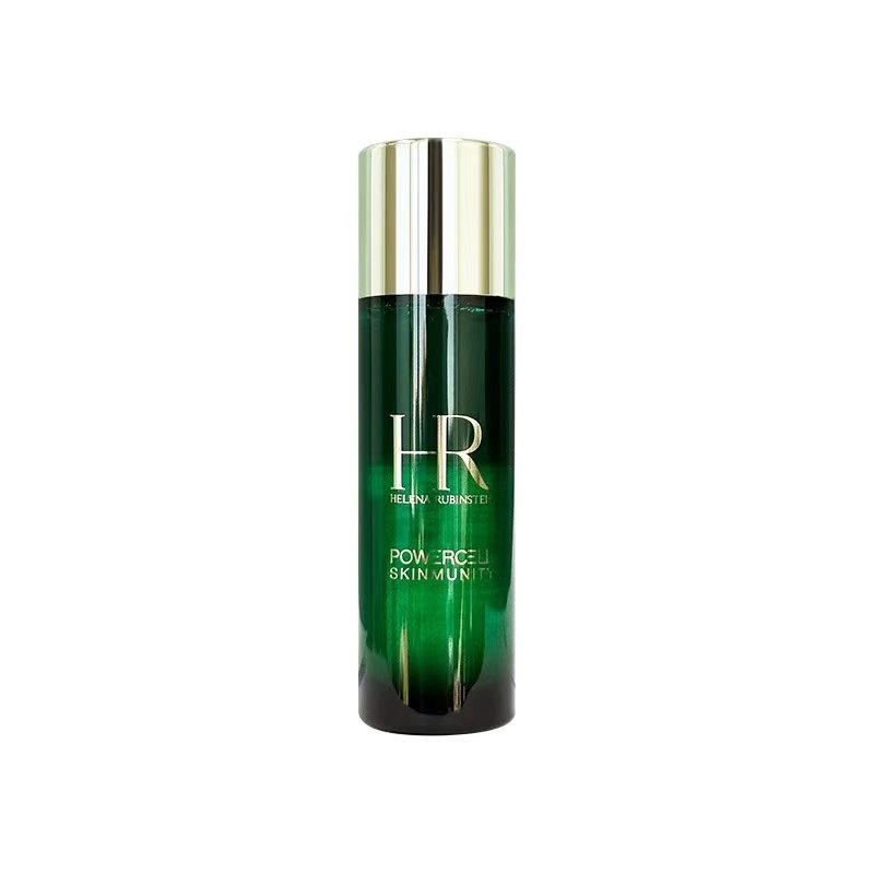
To see how these principles play out in real-world applications, let’s take a look at some well-known cosmetic brands and their use of color in packaging through the lens of the Five Elements.
- Estée Lauder: Iconic Elegance and Metal Energy
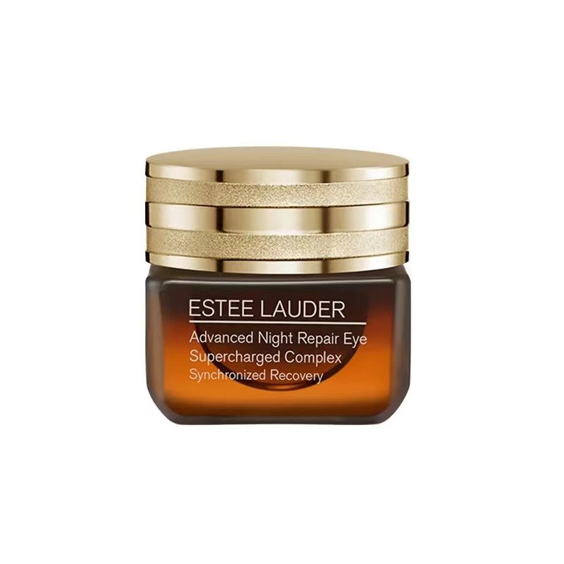
Estée Lauder is a brand that frequently uses Metal element colors such as gold and white in its packaging. The brand’s luxurious serums and creams often come in white or clear glass bottles with gold accents, signaling purity and high value. For example, the Estée Lauder Advanced Night Repair serum, housed in a sleek, dark brown bottle with a gold cap, combines Earth and Metal elements, reflecting both the product’s nurturing qualities and its premium status. - Chanel: Timeless Black and Water Energy
Chanel, a symbol of luxury and timelessness, often incorporates Water element colors such as black in its packaging. The iconic Chanel No. 5 perfume, for instance, comes in a minimalist, clear glass bottle with a sleek black cap, combining Metal’s elegance with Water’s depth and purity. The use of black in Chanel’s packaging is synonymous with sophistication and exclusivity, aligning perfectly with the brand’s refined image. - Clinique: Freshness and Wood Energy
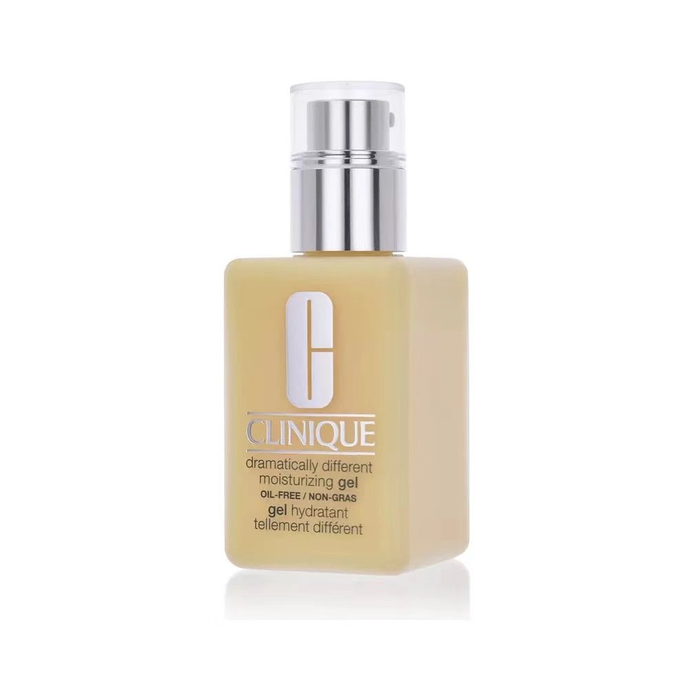
Clinique is a brand known for its clean, clinical image, and it often uses Wood-element colors like green to convey freshness and natural ingredients. The brand’s signature green packaging, used for many of its skincare products, highlights the brand’s focus on dermatologically-tested, nature-inspired products. The pale green packaging of its moisturizers and cleansers reinforces the idea of gentle, plant-based care.
How to Apply the Five Elements to Your Own Product Packaging
If you’re a cosmetic bottle wholesaler or a cosmetic brand looking to match the colors of your glass bottles and lids using the Five Elements theory, here’s a step-by-step guide to help you create harmonious packaging designs:
- Determine the Elemental Energy of Your Product
Start by analyzing the qualities of your product. Is it bold and passionate, or is it soothing and nurturing? Is it luxurious or practical? Match the core essence of your product to one of the Five Elements:- Wood: For eco-friendly or innovative products.
- Fire: For bold, vibrant makeup or fragrances.
- Earth: For skincare products focused on hydration and healing.
- Metal: For premium, high-end products.
- Water: For hydrating, purifying, or fluid products like toners or mists.
- Choose Colors That Align with the Product’s Element
Once you’ve identified the element that best represents your product, select colors that correspond to that element:- Wood: Green, blue.
- Fire: Red, orange, pink.
- Earth: Brown, yellow, beige.
- Metal: White, silver, gold.
- Water: Black, dark blue, aqua.
- Consider the Generation and Restraint Cycles
Use the generation and restraint cycles to create balance in your packaging design. For example, if your product is a hydrating serum (Water), pair dark blue (Water) with a silver cap (Metal), as Metal generates Water. Avoid combining elements that restrain each other, such as red (Fire) with black (Water), unless you are specifically aiming for contrast. - Work with Designers or Manufacturers
Communicate your design goals clearly with your bottle and packaging manufacturers. Provide them with guidance on the color palette and how it relates to the Five Elements, ensuring that the final product aligns with both your brand vision and the energy you want to convey.
Conclusion and Key Takeaways
In the cosmetics industry, packaging plays a crucial role in creating a brand’s identity and connecting with consumers. By using the Five Elements theory to guide the color matching of glass bottles and lids, brands can create visually harmonious designs that evoke the desired energy and emotions. Whether you’re aiming for boldness with Fire, purity with Metal, or calm with Water, aligning your packaging with the right element can make all the difference in attracting and engaging customers.
By considering both the colors and the relationships between the Five Elements, cosmetic bottle wholesalers and brands can create packaging that not only looks beautiful but also resonates with the core essence of their products.
